As banner blindness is so prevalent, the next obvious step is to display a full screen popup so a visitor can know about the newsletter or Facebook page before being allowed to see the content they came for… That’s a great idea!
It seems that so many companies are thinking this way and it infatuates me. Im not sure why I am so annoyed by it, but there are a few things that grate me, and this is has to be latest entry in the list. Finding a home with people that do not indicate when changing lanes and companies that make it more difficult than necessary to pay them. The first time I saw one of these popups I was audibly offended, muttering “what the fuck is this?”. And that’s how I have felt ever since. I have realised why I am so offended. It’s asking me to to do something or give over something, before I can see the benefit. Usually the popups ask me to subscribe or like the company on Facebook before allowing to see what I came for. My details or a blue thumbs have value, not a lot of value but still value, otherwise they would not be asking for it. Therefore I consider it a form of payment and I need to get something in return. Maybe the content on the page is more than good enough for a like or subscription and yes they are usually easy to dismiss, but the audacity to ask me before I am able to make the choice is what makes me angry. Even if they are offering a discount, I need to know what it is that is being discounted before I can make that choice.
Maybe I’m over reacting, maybe I’m not angry about them, just really annoyed by them. But that’s really not the place I should be when visiting a site. I should be made to feel welcomed and that coming to this particular site was the right choice. I would like to say that I am passionate enough to close the tab as soon as I see the popup, following in the foot steps of Tab closed didn’t read. But I can’t. After I sigh I just dismiss the popup and get to the content behind it. It does however leave a bad taste in my mouth and I believe that they site has to work even harder to gain my favour again.
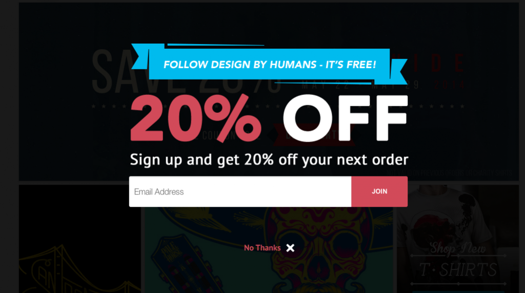
“Even if you are offering a discount, I need to know what is being discounted before I can make that choice.” Don’t just expect that I’ll want to subscribe. Allow me the opportunity to make the choice. – www.designbyhumans.com
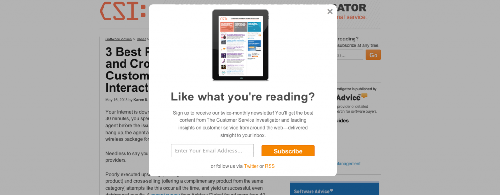
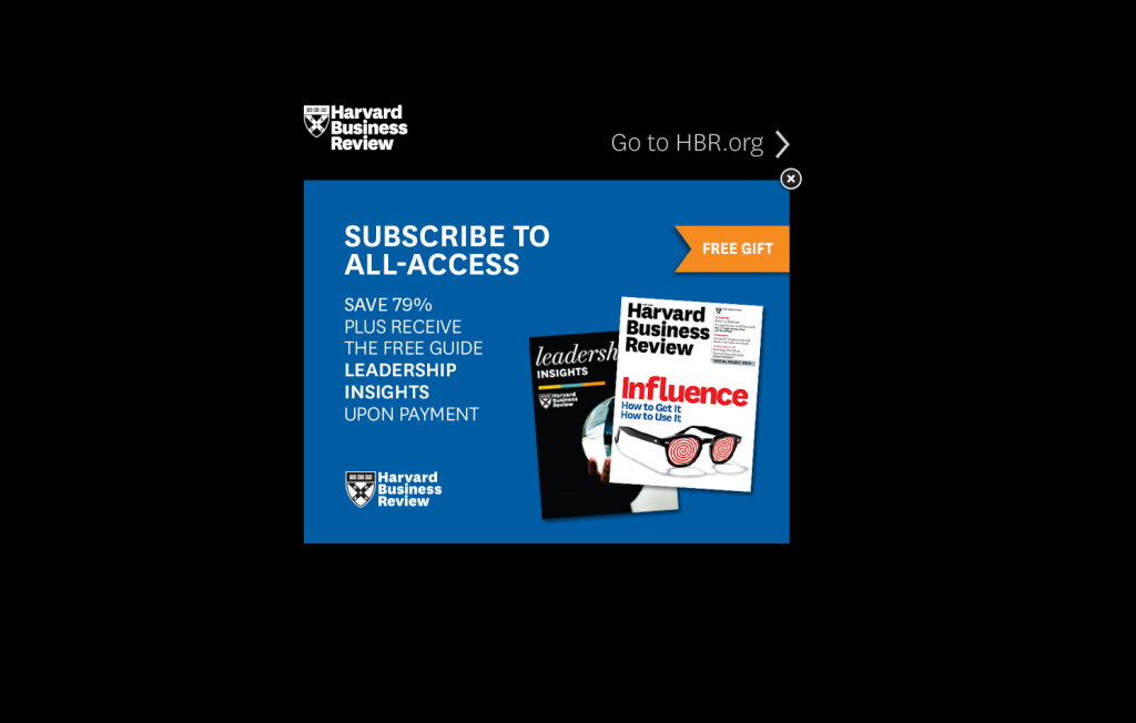
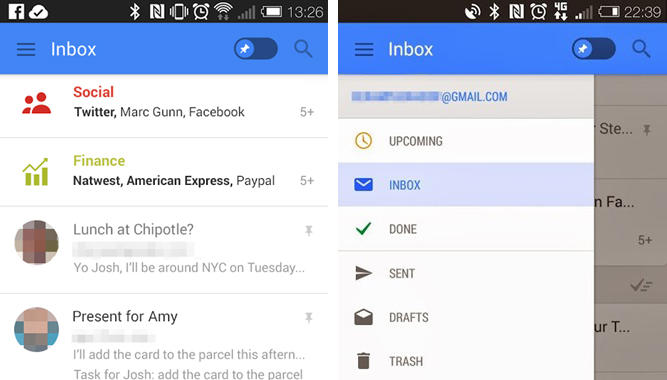
Some more examples I have unfortunately experienced
[Update] In the response to this post, I have learned about some more sites/articles (thanks!)
– I don’t want your fucking app (.tumblr)
– Why you shouldn’t popup a modal dialog when first loading a page (.reinteractive.net)



About The Author: Chris Metcalfe
I'm not sure if I know want I want to be when I grow up. I have so far tried the entrepreneurial thing, industrial design, sound engineering and professional magic. I have been a UX designer for a decade now, so it looks like this might be it?
More posts by Chris Metcalfe