I was recently shown an article on TNW about how side drawer navigation could be costing you half your user engagement. This is something that I have been thinking about for a while. Hiding the navigation off screen has to in some way must be make it harder for people to find their way around your app. If they do not see a list of possible options, how will they will know they exist? In his article Antony Rose mentions a few times: “Out of sight out of mind“. And to an extent I have to agree. If you want users to know about other areas of your app, having them visible is far more effective than hiding them away. Users only activate the off screen navigation when they are looking for something, so if they are content with the page they are on, they will never know about your other offerings. But (yes.. the obligatory ‘but’) the cost of having a permanently visible navigation needs to be understood. Obviously there is the real-estate issues, the more you use up with links the less area there is for the actual content they came for. Often you can get away with it on an iPhone because you know the screen size, but Android or web apps could be running on almost any size screen, so it has to be responsive. The slightly more inconspicuous cost of having a permanently visible navigation relates to the hierarchy of the use of real-estate. Mobile first has taught us that we need to identify the most important content and only show what is needed at the correct time. Anything that uses up pixels needs to be involved in this audit, including the nav. So the question is: Is the navigation more important than the content that the user came to see? In some cases a good equilibrium can be found, but if the screen is too small or the content simply needs the space, the nav shouldn’t get in the way.
Off screen canvases are the best option that we have at the moment to get the nav out of the way, and its not going anywhere soon. Android is pushing it hard in their guidelines and response web looks like it has adopted it as standard. Kyle Peatt mentions in Off The Beaten Canvas: Exploring The Potential Of The Off-Canvas Pattern that we should be using it even more than just navigation because it is so versatile.
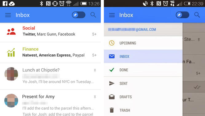
But how do users know about the pattern if they have never seen it before? They will clearly never find the offscreen navigation and probability just close the app shortly after opening it. Android does not seem to worry about this seeing that their design guidelines have little to no affordance to let a user know that clicking the three tiny lines will show a menu. They pretty much rely on the app’s onboarding process to teach new users about this pattern. Which surprisingly enough, seems to be working. On all the apps that we have tested, (that have decent onboarding processes) the hamburger icon is learned quickly and understood. We have also noticed that in many tests of the small viewport of responsive sites, users are understanding the hamburger icon, even without the onbarding process. Admittedly the prototype designs that I have tested are not as avant-garde as Android’s. I use word ‘menu’ under a very button looking hamburger icon to improve the affordance of the pattern.
![]()
With this and almost all Android apps and many iOS apps using the hamburger icon, it looks like the pattern is winning. Im not sure if it has to do with the majority of Android phones in South Africa or simply that Facebook is using it, but it seems that South Africans are becoming au fait with the icon and the concept of off screen navigation.
That does not mean that I think it should be used all the time. As I have mentioned if the nav can be shown on screen without detriment to the content, there is not reason to hide it away. But it is a fantastic pattern that if used well can allow apps to offer far more than without it. And the more it gets used, the more comfortable it will become as a standard UI element.

About The Author: Chris Metcalfe
I'm not sure if I know want I want to be when I grow up. I have so far tried the entrepreneurial thing, industrial design, sound engineering and professional magic. I have been a UX designer for a decade now, so it looks like this might be it?
More posts by Chris Metcalfe