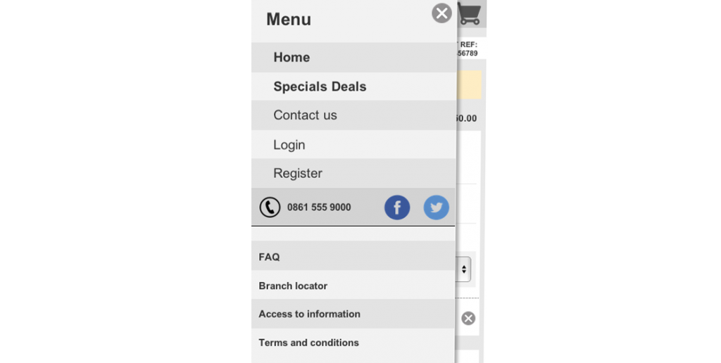
A few weeks after I mentioned that the hamburger icon is going to be hanging around for a while, Google contemplates ditching it all together. The new Android Google plus app significantly challenges the current android guidelines by removing the hamburger icon and placing the menu items in a drop down called “everything”. There has also been some rumours that this will carry over to Gmail too. With this and all the chatter flying around about how the hamburger icon does not work, I have to question my prediction and possibly look for other universal mobile navigation pattern. I say that quite loosely as each operating system has different navigation patterns but we really need to find at something for mobile web that can work across all screens and operating systems. And up until now I believed that to be the hamburger icon with the word menu, and a offscreen canvas or toggle menu.
Apple fans have been punting for the tab bar approach to navigation saying that you should be able to work your information architecture to fit into the five places in the tab menu. And as much as I agree that you should be able to sort your IA into something manageable and avoid the basement effect of Facebook, I do not think that this is always possible. The solution Apple have if you can’t fit the contact into those five places, is to use the three little dots on the last icon as an overflow ‘more’ menu. ( Feel a little familiar? ).
The reason I don’t like the tab menu as a solution to mobile navigation is that its not a universal mobile navigation. It can work well as an app navigation but it doesn’t work for web. It requires sticky navigation (not so great for low end phones) and it only works well when you know the viewport sizes. On smaller screens the nav takes up too much real-estate or the icons and labels start to get too small to identify comfortably. And in bigger viewports, closer to that of desktop, the nav will either need to pop to the top or stay at the bottom and challenge common practice. This just doesn’t feel right.
As I mentioned in my previous post, Apple’s tab nav does however address one of the major downsides to the off screen navigation: Out of sight out of mind. Even though I do not think that this is a good enough reason to loose the real-estate that could be used for the content the customer came for, it still has many merits. Google’s new navigation though, looks like it has taken the worst of both worlds. Not only It takes up more space, it doesn’t surface any of the options listed in it. You still have to open the drop down to see what’s available.
It seems that neither of these patterns are right and we will have to keep working towards something awesome. Even with all the negativeness, there is a part of me that still thinks that the hamburger icon and the word menu, will win in the end. Yes it is a learnt pattern, and yes there is a chance I’m being blindly stubborn, but in almost all my usability tests it passes perfectly. And I can’t argue with that. I feel that it will go the way of the drop down or accordion and become just another known web pattern. It’s not perfect but it’s known and I think is still be best pattern yet.
About The Author: Chris Metcalfe
I'm not sure if I know want I want to be when I grow up. I have so far tried the entrepreneurial thing, industrial design, sound engineering and professional magic. I have been a UX designer for a decade now, so it looks like this might be it?
More posts by Chris Metcalfe