As much as we try and create delightful user experiences with awesome UI and great process flows, we all know that it really always boils down to the content. It does not matter how fantastic your navigation is or how awesome the checkout process is, if the content is crap no one will care. Airbnb learnt this when they realised that the photos they had of their establishments where just not good enough and it was costing conversion. So they took the matter into their own hands, and sent professional photographers to the take photos for them.
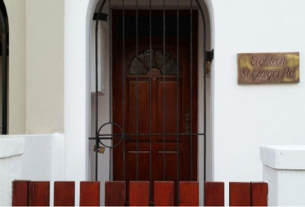
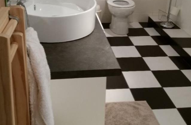
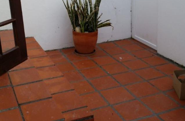
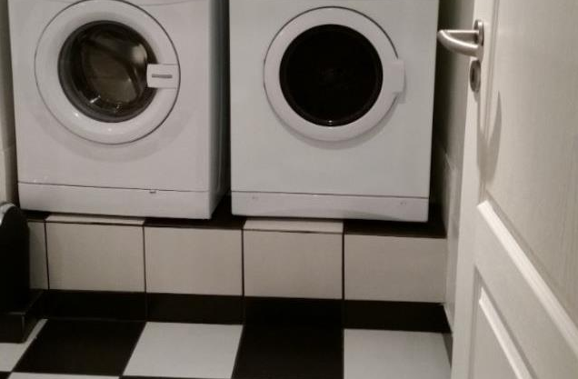
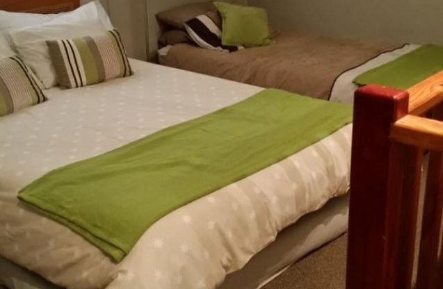
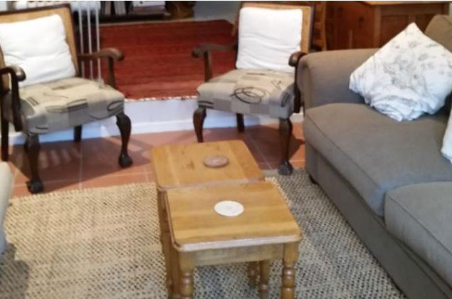
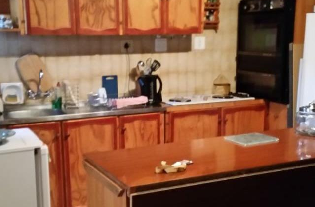
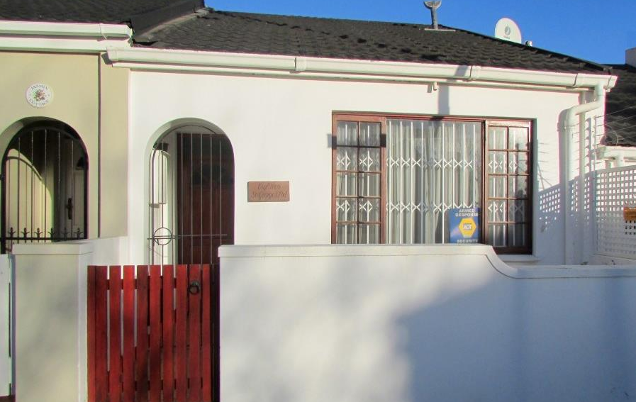
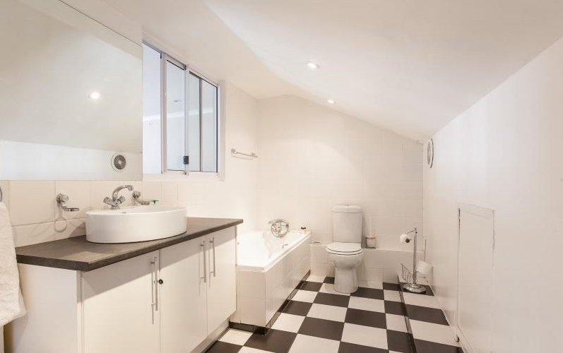
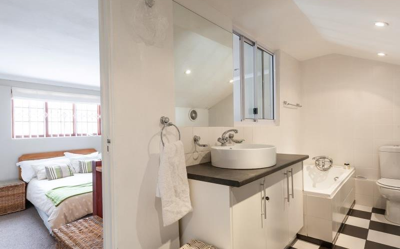
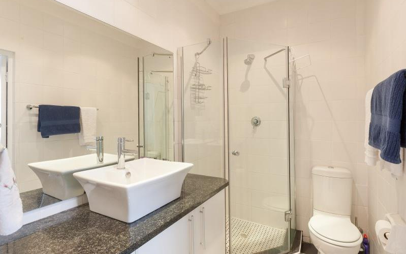
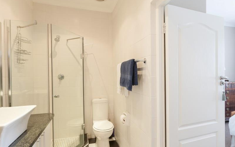
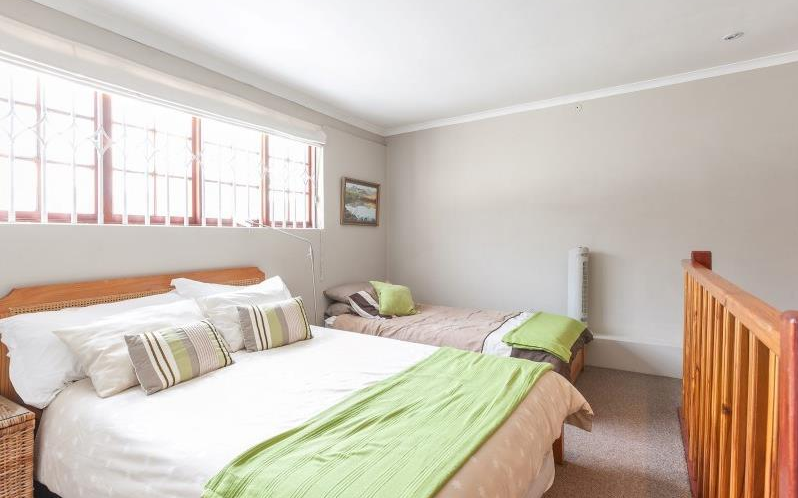
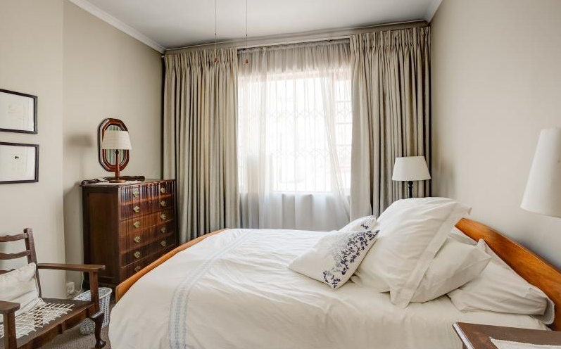
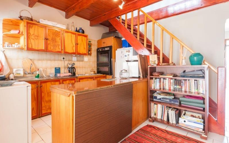
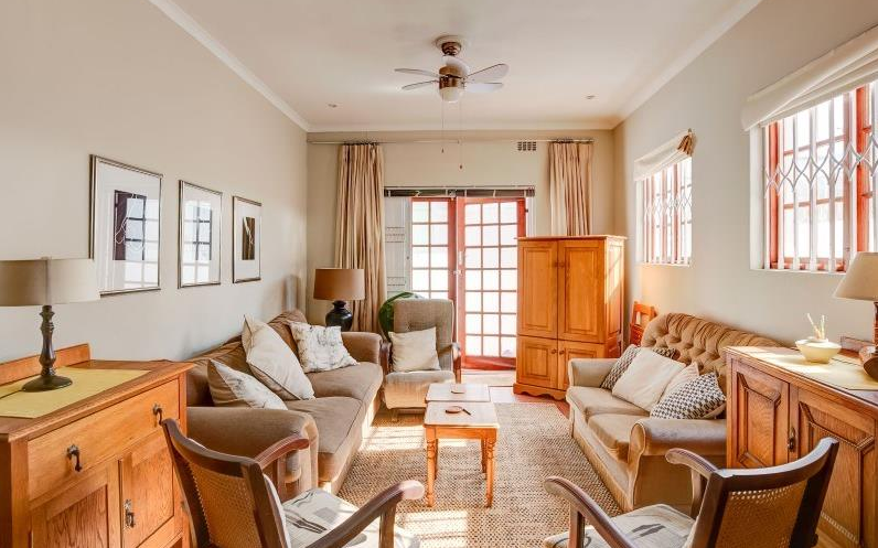
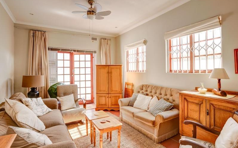
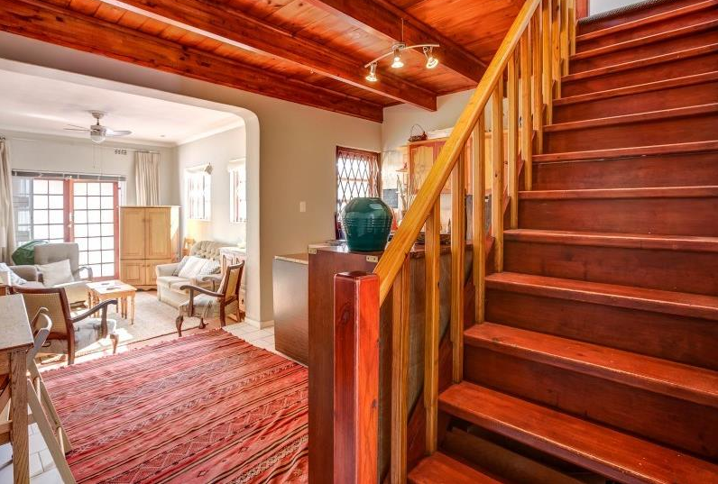
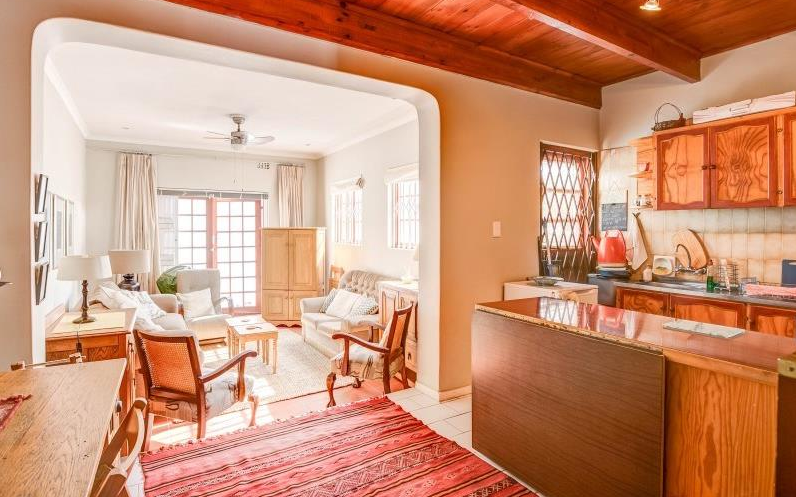
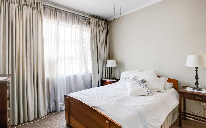
I was reminded of this while looking for a house recently. I found two listings of a house on Property24, each with a different estate agent. The house is the same and the price is the same but the experience was totally different. I was going to write a long post with stuff about how if you have one job, you should really learn how to do it properly and things like that, but I think that I will just let the images speak for themselves and you make up your mind. I do not think that Property24 needs to be as drastic as Airbnb was, but I hope that the estate agents will soon realise wich one is getting more traffic.
Estate agent 1:
And estate agent number 2:





About The Author: Chris Metcalfe
I'm not sure if I know want I want to be when I grow up. I have so far tried the entrepreneurial thing, industrial design, sound engineering and professional magic. I have been a UX designer for a decade now, so it looks like this might be it?
More posts by Chris Metcalfe