The hatred toward skeuomorphism, was palpable at around the time Jony Ive became the head of the human interface of Apple in 2011. And thanks to Steve Job’s bizarre relationship with his leather chair, Apple was without a doubt the worst culprit in keeping this dyeing horse alive for way past his prime. Needless to say Jony Ive finally gave skeuomorphism the funeral it needed with iOS 7… Or did he?
I believe skeuomorphism is still alive and well, it’s just had a facelift. The cheesy and outdated stylings have been stripped away and replaced with texture and depth of real life. It’s actually necessary for an understandable interface to embrace skeuomorphism, especially in South Africa. The backlash to cheesy skeuomorphism was an overly flat design adopted in full by Windows mobile 7 then Windows 8. I personally love Windows 8 design, I love flat design, but I have to admit that it does not do very well for interactions. Very flat design removes much of the needed affordance on interactive eliminates. I have tested this many different flat styled buttons and come up with the same result. As much as I want it to work with all my heart, it just doesn’t.
In one example where overly flat design failed for us, we were testing an offscreen filter button for a mobile view of a search results page. The offscreen filter is already a difficult concept for many South Africans and we have seen a few variants of the call to action that have tried to make it easier to understand: Narrow, Filter, Reduce results… This example this was no exception. The filter was just not being found even with the different titles. We found in the end that it was not really the title of the button but rather the styling that was causing the most confusion. We stuck with ‘Filter’ as it seemed to yield the best results and tried many different stylings of the button. We originally wanted a truly flat design because the final product is elegant and higher end, but more button-y and three dimensional we made the button the better the results were.

I’m not saying we shouldn’t move forward away from the antiquated glossy buttons and drop shadows. I really don’t want us to be stuck in the past, but we have to move forward at a pace that allows new affordances to be learnt. There is still a need for skeuomorphism to teach us how the interface works, especially in a country where the majority of the tech users are not that tech savvy. It just must be representative of the time.
iOS and Android are both pushing the boundaries with flat design while still relying on skeuomorphism to show layering, movement and give needed texture. Apple has it’s frosted glass and set back wallpapers, while Android has its new material design. They rely on a more subtle manifestation of skeuomorphism for their affordances to push the boundaries of graphic design while still allowing users to figure out how it works.
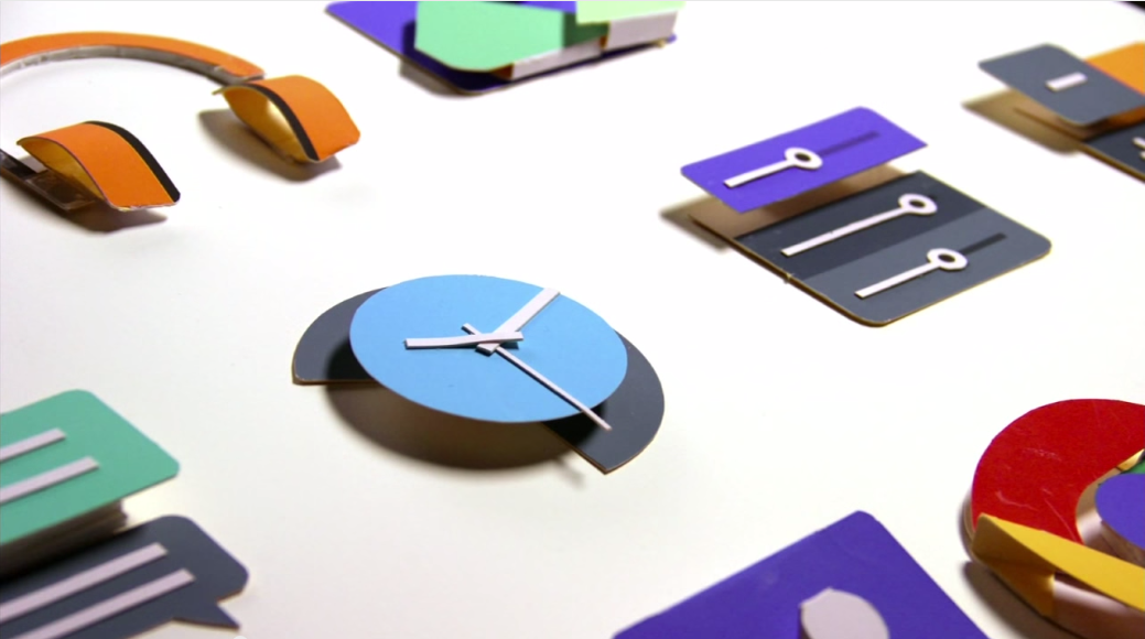
iOS and Android’s new designs are in fact more skeuomorphic than the old cheesy versions. The older versions just relied on graphic images to fake the real life feel, where iOS 7 and Android’s Material design focus on how these layers will not only look, but how they would interact in the real world. Material design is pioneering this by generating real shadows on the layers, getting as true to life movement of the panels as possible, and getting them to not only look like each card is a piece of paper, but make it feel like it is too.
Apple’s old cheesey skeuomorphism facelifted layers and textures
Google Material design’s layering of objects
Extract from Google Material design guidelines:
A material metaphor is the unifying theory of a rationalized space and a system of motion. The material is grounded in tactile reality, inspired by the study of paper and ink, yet technologically advanced and open to imagination and magic.
Surfaces and edges of the material provide visual cues that are grounded in reality. The use of familiar tactile attributes helps users quickly understand affordances. Yet the flexibility of the material creates new affordances that supercede those in the physical world, without breaking the rules of physics.
The fundamentals of light, surface, and movement are key to conveying how objects move, interact, and exist in space in relation to each other. Realistic lighting shows seams, divides space, and indicates moving parts.
Featured image from: https://www.youtube.com/watch?v=isYZXwaP3Q4


About The Author: Chris Metcalfe
I'm not sure if I know want I want to be when I grow up. I have so far tried the entrepreneurial thing, industrial design, sound engineering and professional magic. I have been a UX designer for a decade now, so it looks like this might be it?
More posts by Chris Metcalfe